This post is a little late I suppose. I did start back at school weeks ago already.
I'm just taking one night class: Introduction to Commercial Photography.
I was enrolled in a Photoshop class, but after learning that the first 3 hour lecture would be about using the pencil and eraser tools (waaaay too simple for my skill level) I dropped it. So I was a little late starting this new course, but it's going well so far.
The class is revolves mostly around shooting in studio and then having our work be evaluated.
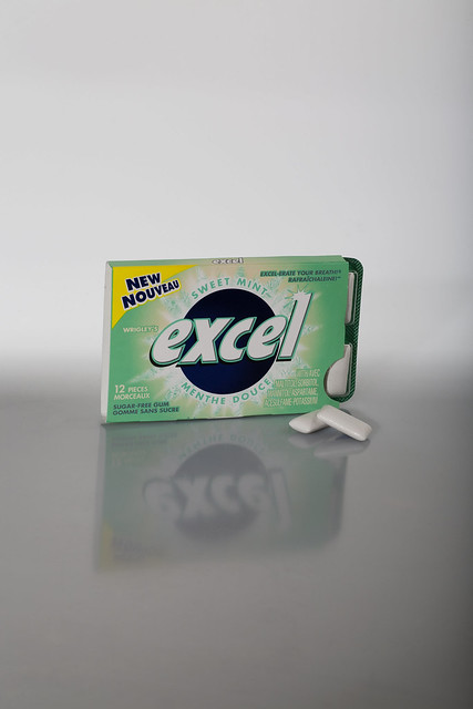
I attempted to shoot a new pack of gum.

I really wanted to get the classic shot, with the reflection of the gum in the surface below and I fought with the limited supply of lights for hours. I found out later that the reason I couldn't get it to look clean was that the white surface wasn't shiny enough. Better knowledge for next time, when I'll shoot it completely differently.

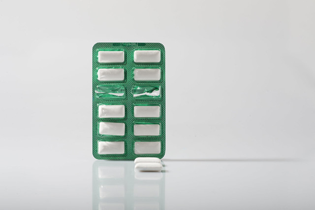
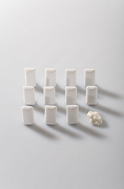
Once I stopped trying to get the package shot, I moved on and just played a little bit. Then I ended up taking this photo below, which I really love, and my Prof did as well - saying I "elevated the subject matter to something graceful and humorous at the same time, giving it personality."
Whoo hoo, I'll take that evaluation :)
I really do like this shot.
Have a great weekend! Are you up to anything exciting?
Have a great weekend! Are you up to anything exciting?


The class seems like so much fun.
ReplyDeleteI can't wait to see more pics (as usual).
great shots! Sounds like a great class :)
ReplyDeleteI like all three, but I think each one gets better. I think the reflection looks good in the first one, and then better in the second. I really like the placement of the gum in the second, and I love that you can really notice the crinkleyness (not a word) of the broken blisters on the packet. The third one is pure fun, and to me it captures one of the elements that (I think) commercial photography should be about; pulling you into the ad without you thinking about it being an ad.
ReplyDeleteHave fun and learn lots in your new class! I can't wait to see your new work.
They're all really good, but I agree with your prof, the last one is especially excellent. It'd make a really effective ad, I think.
ReplyDeletei love the third one...great lighting and contrast! You've got a great talent!
ReplyDeleteJust stumbled upon your blog and wanted to comment! :-)
xoxo
Aarean
colorissue.blogspot.com
(this is my new blog! Come on over and follow along if you'd like!)
So simple. But so fun. Thanks for the love on my blog. <3
ReplyDeleteHi Mel! I really like that last shot too :) You mean Queen St. T.O., right? I haven't yet, but thank you so much for the suggestion! I will try to check the store out next time I'm in town :)
ReplyDelete-charlotte
I definitely agree with your prof about the last one- what a great concept!! :)
ReplyDeleteThese shots are crazy cool. How fun!
ReplyDelete-Arielle
humblepievintage.com
I love that last one too - so creative!
ReplyDelete